Thursday, January 8, 2009

Desperate To Be Different

Seattle Central Library: It's gotten rave reviews from all sorts of architecture critics. But does that mean it's any good? Here are the points on the plus side:


  • It holds a lot of books

  • The skin is nearly all window, so the lighting is pretty good in the reading rooms

  • It doesn't smell as bad as the old library

  • It's interesting

  • The "Friends of the Library" shop has cool stuff


On the negative side:


  • Being different is expensive, so they had to skimp on the elevators. They are too few and far too slow.
  • There are escalators serving some levels, but they are freaky. See below.
  • Not good for anyone with a fear of heights
  • Sickening color schemes

The walkway outside:


Plaza on the other side:


Hallway on the meeting room/restroom level: (All you see is dim blurry red?

Yes, that's right. It's not just the photo.)


Look! Some books:


Looking way, way down to the reading room:


Freaky escalators with nauseating color schemes:
(The one with the hole in the wall is an "art" installation and it talks to you in a creepy voice.
I couldn't get a clear picture of it, which is just more proof it's possessed by demons)


Floor in the multilingual area:
(It's embossed with words in many languages...so it's grimy)


The putt-putt elevators:

Monday, November 24, 2008

Good: Weather Vanity

I'm pretty sure there is no practical reason to have a weathervane, but I like them anyway. Here are a few I saw while walking around town:


This isn't a weathervane, but it's pretty hilarious. It's on a little crackerbox-size house.

Monday, October 27, 2008

Almost Good, Except…: If You’re Going To Build A Castle, Don’t Do It Halfway

This house has a lot of re-chido features. It has a lion guarding the entrance:


It has a garden wall with a little door:


Gargoyles!:


Love the twisty chimney:


Even an entry tower, and crenellation on the terrace:

Could’ve been really awesome, but the windows look all wrong to me, the back doesn’t match, and the roof isn’t really castle-perfect.

Monday, October 13, 2008

Good: Topping It Off Right

Some people put thought and effort into putting the right roof on a building. Here are some examples [note: I took all these pictures sitting at my desk. This item brought to you literally from my point of view]:


This one has a sail-like triangle enclosure on top, which, combined with the stripy curves on the walls below, has a subtle nautical effect:


By the way, that dark thing on the flagpole is a PERSON. I used binoculars, and it looked like he was either cleaning or painting the pole. What an awful job. Made me dizzy to look at him. That building is about 50 stories tall.

Here’s another pretty chapeau. Stylish, goes with the building, keeps the neighbors from having to look at cooling towers and whatnot:


And here, in another style, is another appropriate roof. The barrel shape is reflected in the roof of the podium level below, which you can’t see in this picture:


This last pretty roof is on the building I used to work in, soon, I’m sure, to be renamed something other than Washington Mutual Tower. That pyramid shape doesn’t just hide the mechanical equipment; there is also a basketball court in there. Also, behind those arches are terraces you can walk out on if you’re nice to the right people, and the view is spectacular:


Of course, most commercial building people don’t bother with such niceties as roofs which do much besides keep the rain out, so we all have to look at atrocities like this:


I don’t understand it. Spending millions of dollars to build nice walls, then just tarring the roof and throwing a bunch of junk on it? Like no one is going to see it? It would be like building a house with a really fancy front, with nice windows and rockwork, then using cheap windows and vinyl siding on the sides and back, because no one’s going to look at that (besides you, and your neighbors, and anyone you invite over for a barbeque, and the meter reader, and people who drive by…). Oh, wait. Plenty of people see no problem with that.


Here’s another analogy: it’s like making yourself a fancy dress for some nice event, but then, because zippers cost extra and are a pain to sew in, just leaving the back hospital-gown style.

Monday, October 6, 2008

Bad: It’s a Jungle Out There, Only Two Blocks Away

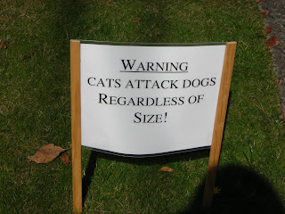
Apparently my neighborhood is much more dangerous than I had thought. I saw these signs in a yard the other day:


What are the chances that one family would happen to have THREE dog-attacking cats? Either something is very wrong in that household, or the cats are totally normal and this is just a strategy to keep neighborhood dogs out of their yard. Although I also suspect that “White Cat” is angry because no one could bother to give him a real name.

I'm sort of curious to see these cats, but I'm not sure it's worth the risk. Maybe these people have a safari jeep I can ride in for the tour through their yard, and maybe I'll get lucky and it will be feeding day...save me the trouble of a trip to Africa.

Thursday, October 2, 2008

UGLY: So Expensive, Yet So Cheap

Found the house I was looking for earlier! And is it ever a sight to behold. I believe the official name of this style is “Cartoon Pretentious.”


I have no idea what the designer was thinking, aside from maybe, “if we put some of a lot of things that are known to be fancy, it will look fancy…right?” WRONG. This house, which, by the way, occupies a VERY valuable plot of earth, is like a study in awkwardness and fakery, to the point where it almost seems as though that was the intent…but who would spend millions of dollars for that purpose?

Let’s look at the sides and back:


Yes, it’s even cheaper and less tasteful back there. Look at those flat windows, that senseless roofline. By comparison, the playhouse/garden shed/whatever is pretty cute. I mean, it needs an architrave or something on those columns, to start with, but cartoonishness always looks better on children’s things.

Tuesday, September 30, 2008

Good: Movin' and Groovin'

Ah, fall, when the air is crisp and a young lady’s thoughts turn to exercise. Mine, anyway. Brisk air is conducive to movement. Of course, once the rain starts I mainly do my exercising either in the gym or dancing around my living room, which means I need some tunes. Here are some of my favorite aerobically stimulating songs:

· “Shake It,” Metro Station. The name says it all.

· “La Vie en Rose,” Belinda Carlisle. Rather rosier and more upbeat than Edith’s version.

· “Here It Goes Again,” OK Go.

· “Tres Deseos,” Gloria Estefan.

· “Footloose,” Kenny Loggins.

· “El Pibe de Mi Barrio,” Dr. Krápula. The artist’s name crack me up, but the song is fun too. And, since I had to look it up, I’ll mention it here: Pibe = kid.

· “Hot, Hot, Hot,” Bina Mistry. I have a lot of versions of this song…Buster Poindexter, Caribbean steel drum, Sesame Street…this one is my favorite.

· “I Ain’t No Quitter,” Shania Twain. Makes me laugh.

· “The Rockefeller Skank,” Fatboy Slim.

· “Come On, Let’s Go,” Ritchie Valens. Some day, when I have my own band, we are going to do a really awesome cover of this.

· “Send Me On My Way,” Rusted Root. This is good for doing abdominal crunches.

· “Pon De Replay,” Rihanna.

· “Move Your Feet,” Junior Senior.

· “Body Movin’ [Fatboy Slim Remix],” Beastie Boys.

· “Santa Monica,” Everclear. Also fun to sing at full volume on a long solitary road trip, not that I would know personally or anything.

They’re hippin’, they’re hoppin’.